Content Design Essentials: Errors
When writing error messages, make sure users understand what has happened and what they can do to fix the problem. Think of error messages as a blueprint for a solution, not just as an acknowledgement of a problem.

What's an error message?
Error messages tell users that something has gone wrong in the past. Some kind of problem has occurred and users have to take action in order to solve it. This makes error messages different from other, similar messages, such as warnings or confirmation dialogues – those relate to something that might occur in the future.
Error messages are the roadblocks in any digital experience. The little bumps along the road. While nobody likes to see them, they are necessary to highlight an issue, and, most importantly, to help users fix it.
So don’t think of your error messages as, “Oh my god, something went wrong", but rather: “Something went wrong. Here’s how you can fix it." To do that, your error message should answer these 3 questions:
- What went wrong?
- Why did it go wrong?
- How can users solve this?
(If you don’t have a lot of space, for example when you’re writing inline error messages, focus on 1. and 2. – those are the most important ones. The key is to let users know what went wrong and to help them find a solution.)
Structure of an error message
Usually, the structure of an error message consists of a heading, some body copy and one or two CTAs. Ideally, your error messages work even if the user doesn’t read the body copy (which is often the case). Let your heading and primary CTA do the heavy lifting.

Heading
Give a concise summary of the problem. Avoid ambiguity (e.g., “Something went wrong"), don’t be apologetic (e.g., “We’re sorry, but…") and don't try to deflect the problem ("Oops..."). Be clear about what has happened.
Body copy
Your body copy should do two things. It should explain the problem. Go into a bit more detail, but keep it concise. And it should offer an actionable solution. That way, users don't get stuck in a “dead end".
CTA (Call to action)
Make sure that the CTA properly describes the action it triggers. Often, a CTA just makes sure that a user has acknowledged the problem. In those cases, "OK" or "Close" can be sufficient.
Sometimes, however, your CTA needs to trigger a specific action, for example "Re-enter password". That's when you need to be more specific and give users an idea what's going to happen when they tap that CTA. If you want to know more about how they work, you can read more about CTAs here (opens in new window)
Tone and voice
When trying to find the right tone for your error message, imagine the user’s mindset. It’s usually not going to be pleasant, and the emotions might range from mild annoyance to anxiety or full-on anger. In any case, nowhere in the “happy" spectrum.
In those situations, a clear, simple way out is probably the best thing you can offer. No long-winded apologies, quirky comments or complicated, technical descriptions.
That's why the tone of an error message should be:
- Straightforward
- Reassuring
- Solution-oriented
Different types of error messages
Most error messages follow the pattern we discussed above. There are a couple error messages that work differently. But whatever kind of error message you’re writing, users should always know what has happened, and what they can do to solve the problem. Here are a couple of examples.
Inline error messages
These appear while the user is entering information, usually on form fields. If a user makes a mistake, don't blame them (“You entered a wrong password!"). Instead, make your message positive and actionable:

Toast messages
Some errors require the user to take action outside of your app or website. For example, when there’s no internet connection. In such a case, it’s fine to just show a toast message that simply states the problem – most users will know what to do with this kind of information.

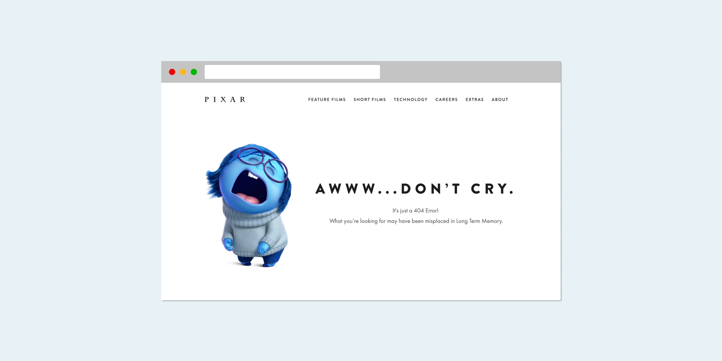
404 pages
A 404 page indicates that the browser is able to communicate with the server, but it can’t find the exact link a user is looking for. And while 404 pages aren't error messages in the usual sense, they work in the same way. They're usually not the most high-stakes kind of error, so you can use it as an opportunity to let your project’s character shine through. Just make sure to spell out the 404 error code and add a link that takes users back to the home page.
One error message per problem
I’ve found that, quite often, developers want to cover multiple error scenarios with a single, “generic" error message. While this can save some work, it doesn’t make sense from a user’s perspective. Generic messages are vague by definition and offer little opportunity to actually solve a problem. Generally, go for one error message per error scenario.
Error messages: to be or not to be
And, last but not least, the best error message is the one that doesn’t even show up. If you know that there’s a problem in the UX, design, copy or code of your project, fix it first – don’t just slap an error message on it and let the user figure it out.
Conversely, the worst error messages also don’t show up: whenever the user does encounter a significant problem, there should be an error message to go with it. Make sure your user always knows what’s going on.

